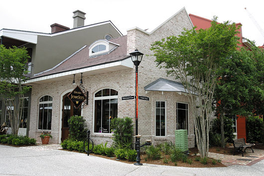
Destin Jewelers
Everything’s fun in the sun with this colorful Florida store
Address: 14091-B Emerald Coast Parkway; Destin, FL 32541 | Phone: (850) 837-8822 or (850) 654-1990
Opened: October 2002 | Est. property value: Rental property. | Cost of build-out and interior design work: $250,000 to $275,000. | Staff: 9 | Store area: 840 sq. ft. | Location type: Quad-plex resort store | Sales in 2003: N/A
A serious approach to fun in the workplace is nirvana for a business owner. After opening their first store in a downtown setting, Elizabeth Carmont and Lisa Peters became enlightened when they found a heavenly location for their second jewelry store in a Florida resort paradise sandwiched between the Gulf of Mexico and Choctawhatchee Bay.
Surrounded by aquamarine waters and a main street called Emerald Coast Parkway, Sandestin Resort’s The Village of Baytowne Wharf seemed destined to be home to Destin Jewelers. As the only jewelry store in the resort, Destin Jewelers has an exclusive on selling gorgeous jewelry.
Sandal-clad and sarong-wrapped, most Destin shoppers are more ready for sun than for sunstones, but that hasn’t stopped tourists from checking out the store as part of their vacation retail rituals. When visitors, business travelers and the occasional local enter Destin Jewelers, it sometimes takes a few moments to register they’ve actually walked in to a jewelry store.
Advertisement
Perhaps it’s the store’s stained concrete floor, which goes from a terra cotta clay color to brown, bringing a little bit of the feeling of the beach into the store. (Of course, visitors also do bring actual parts of the beach into the store as well, which is an even better reason this sturdy, rustic-looking flooring option was used.)
Display cases are set up in art-gallery style so customers can easily browse the store’s fine jewelry. The cherry wood display cases are done in a dark mahogany color with black metal trim around the glass. The standing cases are 56 inches in height, which is higher than average, but consistent with the gallery approach of displaying fine jewelry like fine art.
Although the Gulf of Mexico side of Florida’s panhandle may be prone to cooler climates than its resort counterparts such as Daytona, that didn’t stop Carmont and Peters from using sultry exotic colors. Tropical Fern Green, Tiger Lily Orange and Azalea Pink do more than add whimsy to the stucco-like walls. Each color serves to separate areas of the store.
With creative direction of New York City-based design firm GRID/3, Destin Jewelers made the best use of its unique space. The multi-level 27-foot vaulted ceiling required special attention when trying to implement the barrel-like design. Another unique feature to Destin Jewelers is a decorative bulkhead. Behind a wrought iron balcony is a faux-finished mural a la Henri de Toulouse-Lautrec. Large windows in the front of the store reveal the brightly-lit balcony to passersby at night, acting like a billboard for the store.
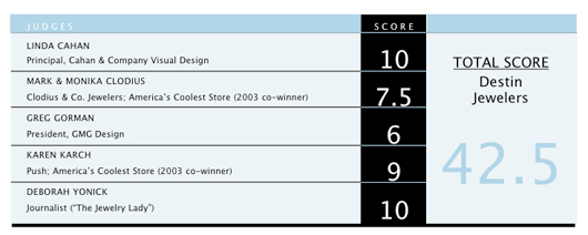
STORE REVIEWS
The store owner on her cool store: “We think our store is cool because we were able to successfully mix a whimsical interior design with seriously fine jewelry. What we often hear from customers is that they don’t see much jewelry back home of this caliber. People can’t believe we have such absolutely beautiful jewelry in one store. And it’s all in a store that is so whimsical. Another feature we like about our store is that the interior and exterior match well.” — Co-owner Elizabeth Carmont
Karen Karch: “The color and shape of space is stunning for its environment. Definitely has a beach holiday feel … makes me fantasize about being on the beach sipping cocktails and relaxing. What a great place to live and own a business! Like the contrast of the dark wood cabinets in the bright space. Like the terra cotta effect on the floors. I was surprised when I saw how quaint the store looks from the outside after seeing how big it looks inside. This was one of two I liked the best.”
Advertisement
Greg Gorman: “Architecturally the space is interesting and I like the use of the mixed paint colors. However, the look is fragmented. The wooden display cases’ finish do not complement any other part of the store. The lighting package with so many different types of styles and finishes is not solid and should have been better thought through. The mural painting above on the balcony doesn’t complement the first floor level. HVA/C vents should have been better planned so as not be as visible and dominant and distracting. Store is light and lively but the floor cases are heavy and dark. [They] do not complement.”
Linda Cahan: “The color in this store is perfect for the locale and the energy of the space. It’s an excellent mix of traditional wood shutters combined with molding and a modernistic flair with color and design. I love the wall ‘windows’ that become the jewelry equivalent of mannequins. The higher cases create an easier viewing experience and I like the mix of the metal and wood. It looks clean and modern. The overall eclectic feel of the store is very appealing, fun and chic.”
Deborah Yonick: “This is that treasure of a shop you find while on vacation and think, ‘I love this store; I must have something from this store!’ From the architecture to the bright, warm colors to the interesting showcases — this store reflects a casual, upscale gallery setting.”
Mark & Monika Clodius: “Very cool, love the use of color. The mirror-chair and frog, while adding whimsy, do not make sense … can you sit there? Really like it, has a lot of personality. Perhaps a little too distracting at first glance, the mission statement of jewelry store is a bit lost.”
STORE IMAGES
{igallery id=”5451″ cid=”150″ pid=”1″ type=”classic” children=”1″ showmenu=”1″ tags=”” limit=”10″}
Advertisement
This story is from the August 2004 edition of INSTORE