Floor Plan:
Sather’s Leading Jewelers
Fort Collins, CO
BY THE INDESIGN TEAM
Published in the January-February 2013 issue
Asavings-and-loan building constructed in 1965 might not seem like the ideal place for a jewelry store. But when Julie Sather-Browne saw it, she knew it had to be the new location of Sather’s. “It had rock pillars throughout the building, both on the inside and outside against the glass. We loved that. And then it had these huge wooden beams going across the vaulted ceiling. It was very lodge, very Colorado. We are Colorado natives, so we thought it was a natural fit.” A redesign by GRID/3 transformed a stodgy bank building into a gorgeous jewelry store that fits the personality of its community.
Advertisement
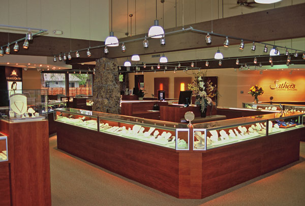
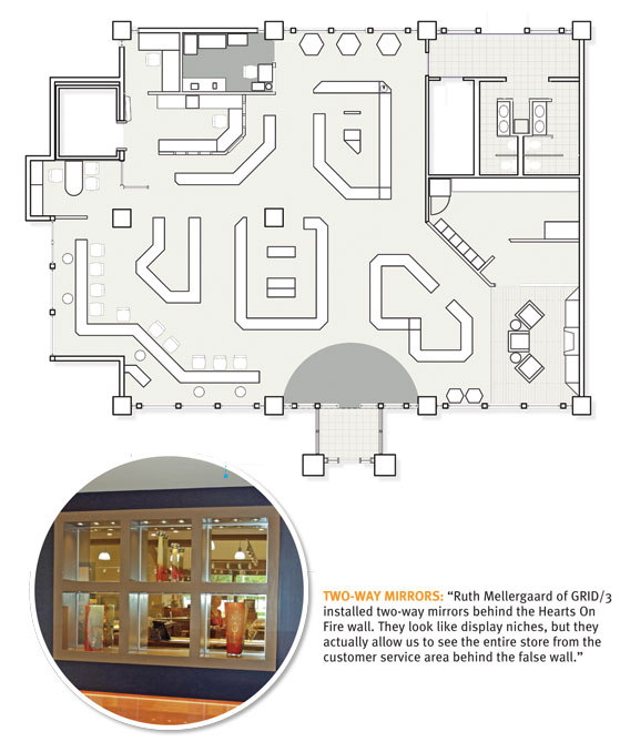
CASE LAYOUT: “We had the natural columns that couldn’t be moved, and three out of the four walls are floor-to-ceiling windows. So it was difficult to create different environments within the store. We also wanted wider aisles and some sit-down cases for bridal, but we didn’t have any solid walls to back the sit-down cases to. It took three renditions to get the case layout just right.”
MIDDLE ISLAND: “This area features our diamond fashion and Tacori lifestyle jewelry, which is bright, fresh, and fashion-forward. People may walk in for a battery and stop right there. It gives us an entry point to getting merchandise out of the showcase and onto the customer.”
SHOWROOM FLOW: “Our showroom is designed to keep people moving in a circle. There are no hard corners. You bump against a case and end up at the next one, like a pinball machine.”
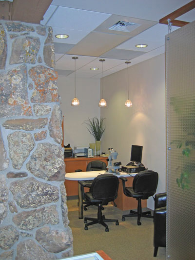
DIAMOND ROOM: “We suspended Lumicor panels from the ceiling to create privacy in our diamond room and yet allow for an open, airy sense of space. You can see light through the panels, but you don’t feel trapped or pressured while you’re in there. Ruth also brilliantly integrated the space from the bank’s former drive-thru area into the diamond room.”
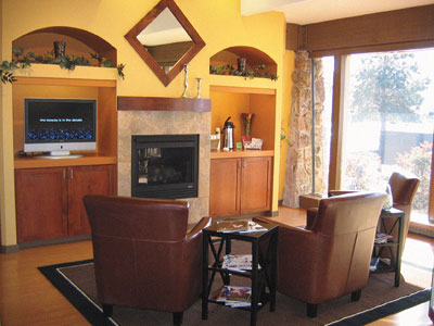
LOUNGE: “We wanted to create something inviting that would feel like a nice lodge in Vale or Aspen. We used warm colors throughout to achieve that feeling, including chocolate, gold, beige, and pops of ochre and rust, mahogany and cherry. It’s a look that says ‘quality,’ but you can also relax and sink into a leather chair in front of a fire.”
Advertisement
FIREPLACE: “The building only had electricity — no natural gas — so we had to bring a gas line in from the street because we wanted a fireplace. When the fireplace is on, it’s great because the floor-to-ceiling window is right next to it. You can see the snow falling.”
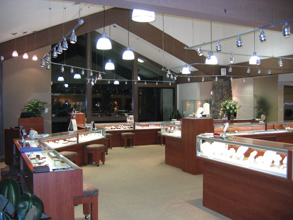
BRIDAL SHOWCASE: “As we show the bridal jewelry, our backs are to the window, which is great because the landscape is really pretty behind us. Customers have natural light to view the diamonds. We’ve hung boutique signs that create environments within each brand, and we created a false wall for Hearts on Fire.”
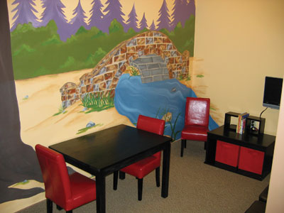
CHILDREN’S PLAY AREA: “The kids’ room was a godsend. It has a chalkboard wall that the kids love, as well as a mural of the mountains. It’s glass, so it’s easy to watch the kids, but it keeps the sound muffled.”