Initially, last week, when Pantone announced their 2016 Color of the Year and, for the first time in its history, chose two colors instead of one, I felt the color forecaster was being lame. At best, indecisive. After all, they claim to be the international color authority–so pick one, why didn’t they? My advice (if anyone had asked me) would have been to take a blender, pour in the runway trends, home design directions, and cultural zeitgeist and voilá—what they should have whipped up is a single shade prediction.
Lorraine DePasque
—
Contributing writer for INSTORE and INDESIGN.
I
nitially, last week, when Pantone announced their 2016 Color of the Year and, for the first time in its history, chose two colors instead of one, I felt the color forecaster was being lame. At best, indecisive. After all, they claim to be the international color authority–so pick one, why didn’t they? My advice (if anyone had asked me) would have been to take a blender, pour in the runway trends, home design directions, and cultural zeitgeist and voilá—what they should have whipped up is a single shade prediction.
Obviously, by naming Rose Quartz and Serenity (a pale blue) as the Colors—plural—of the Year, they did not. Nonetheless, from day one, I have agreed with Pantone, when it says that both colors look to be important in fashion next year. Runway trends on both sides of the Atlantic point to cake-frost pinks and sky/water blues as significant in clothing and accessories, surely in the first half of next year.
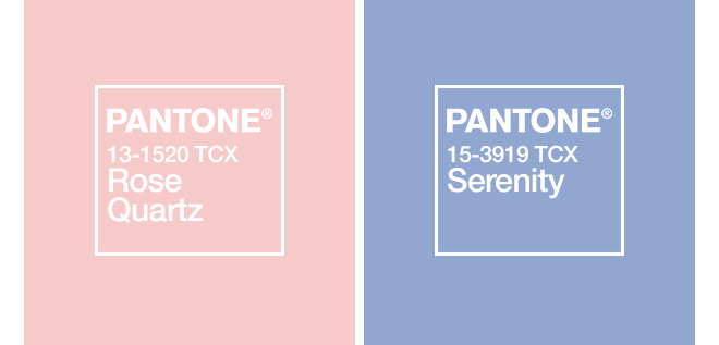 Pantone Color Institute’s 2016 Colors of the Year, Rose Quartz and Serenity
Partially, because of that, I’m warming up to Pantone’s bi-color call. In truth, another reason the “two key colors” thing has begun to appeal to me is because of jewelry. Naturally, it offers the industry an opportunity to play with gems that are in two different color spectrums. Additionally, I think these particular hues together could add a longer life span to rose gold—a metal, which, frankly, I was concerned might start to level off next year, having now become mainstream. The pink/blue pairing is a sensible selection for gems set in rose, providing women with an easily wearable monochromatic look.
Advertisement
If anything, this specific two-color mix should also help keep opal strong—distinctly, opal with inherent blue-and-pink flashes.
To me, it’s affirming that many jewelry leaders, since earlier this year in Basel, have been highlighting pink/blue gem mixes. Aqua blues, especially, with pastel pinks, notably morganite, pink chalcedony, and light versions of pink tourmaline. Since I first saw the “pale shade mates” becoming prevalent back then, I’ve been mentally noting their fresh sensibility.
So, yes, nearly a week after the latest Colors of the Year announcement, I am now on board with Pantone’s decision. Although, I do advise our industry to point out to customers that the forecaster’s choice of Rose Quartz shouldn’t be typically taken literally. In fact, consumers need to be guided to consider the complete kaleidoscope of similar-hue pink gems. When Pantone chose Emerald a few years ago as its Color of the Year, there was less of a chance of such misunderstanding, given that the word emerald is often used as a synonym for green in everyday language, with non-jewelry industry people. Well, that’s just my heads-up, as it may help ensure that Pantone’s predictions will wind up being as rosy as possible at retail.
{igallery id=1306|cid=1538|pid=1|type=category|children=0|addlinks=0|tags=|limit=0}
For daily news, blogs and tips jewelers need, subscribe to our email bulletins here.
Advertisement
/* * * CONFIGURATION VARIABLES: EDIT BEFORE PASTING INTO YOUR WEBPAGE * * */
var disqus_shortname = ‘instoremag’; // required: replace example with your forum shortname
/* * * DON’T EDIT BELOW THIS LINE * * */
(function() {
var dsq = document.createElement(‘script’); dsq.type = ‘text/javascript’; dsq.async = true;
dsq.src = ‘http://’ + disqus_shortname + ‘.disqus.com/embed.js’;
(document.getElementsByTagName(‘head’)[0] || document.getElementsByTagName(‘body’)[0]).appendChild(dsq);
})();
Please enable JavaScript to view the comments powered by Disqus.
blog comments powered by