Shreve & Co.
Address: 329 Stanford Shopping Center, Palo Alto, CA 94108
Owner: Schiffman’s
President: Richard Horne
Phone: (650) 327-2211
URL: www.shreve.com
Year founded: 1852
Opened featured location: 2005
Architect /Design Firm: Steve Lochte of Brand + Allen Architects, San Francisco
Total Store Area: 3,000 sq ft
Employees (at featured location): 11
2005 Revenues: N/A
Land cost: N/A
Building cost: N/A
Interior build-out cost: N/A
Design/architectural firms cost: N/A
Store slogan: “A San Francisco Original”
Five Cool Things About Shreve & Co.
1THE HISTORY
Golden Start
Founded in 1852, Shreve & Co. opened its doors just four years after gold was discovered in the hills of California, with thousands of people flocking to the “gold coast” to seek their fortune. George Coates Shreve and nephew Samuel S. Shreve were no dummies — they knew where the market for jewelry would be, setting up shop on the corner of Montgomery and Clay Streets to sell fancy European goods and California-manufactured jewelry. “They slept in the back room for the first two years, but they prospered pretty well,” says Shreve & Co. president Richard Horne.
2MORE HISTORY
Advertisement
Survival Instinct
In March of 1906, Shreve & Co. relocated to an “earthquake-proof” building at Post and Grant Street in San Francisco, constructed with steel columns and a polished granite base. Again, no dummies here — a month later the infamous San Francisco earthquake rocked the city. “It was the only building within eight blocks to remain standing,” says Horne. Unfortunately, about six hours later a massive fire swept through the city, and employees barely had time to put all of the jewelry in the vault before running away. The building was wiped out, but still stood, and the vault cooled down about three weeks later (guarded by soldiers in the meantime) when the owners could open it. The store moved to temporary quarters and returned in 1909 with a grand re-opening.
3THE STYLES
Classic Modern
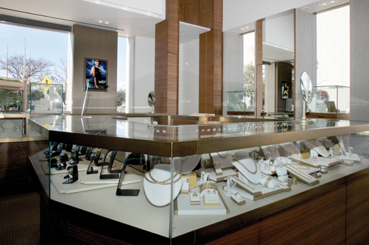
Shreve & Co.’s flagship San Francisco store has been in its current location, with little change, for 100 years — think marble columns, 30-foot ceilings, and original oak-wood showcases. The Palo Alto branch, however, opened 30 years ago in the Stanford Shopping Center, was renovated in 2005 to great fanfare thanks to its bold, contemporary style. “It’s a very leading edge, up-to-the-minute look,” says architect Steve Lochte, who designed the renovated version. “It’s the right blend of warmth and richness which breaks them out of their traditional look but isn’t ultra-hip.” The store boasts a light and airy feel, with natural walnut showcases, cream-colored walls and bronze finishes. Lots of light from large vertical windows and a doubling of the original space (the store went from about 1,400 to 3,000 square feet) help add to the sense of openness.
4THE PET POLICY
Advertisement
Dogs Allowed
“It’s very San Francisco,” says Richard Horne, referring one of his store’s most laid-back features — its dog-friendly policy. “You can bring your dog into the store and we’ll give them a Milk Bone and some water,” says Palo Alto manager George Bentley. “It’s a good icebreaker with the customers. People act like their dogs are their kids. They love it when you give attention to their little baby.”
5CUSTOMER SERVICE
Frequent Buyer Perks
Shreve & Co.’s single coolest event, according to Horne, involved hiring a private jet to fly 10 watch-collecting customers to LA. “We took them to visit a particular watch brand who offered them the opportunity to sit down at a watchmaker’s bench, take apart a watch and then put it together again under the direction of a watchmaker from Switzerland. Usually the vendor uses it as a training session for other jewelers, but we were the first to bring a group of customers who collect fine watches. Then we flew them back to San Francisco with champagne.” — Sharon Goldman

Advertisement
FIVE QUESTIONS
Richard Horne, President Shreve & Co.

1 What cool new technology did you add to the Palo Alto store?
Brand + Allen recommended some new things, like high-intensity LED lighting in the showcases. The idea is when you put an item of jewelry under that light it sparkles like crazy. And then we’re using the latest security technology for our showcases, which is a special security film that goes over the glass.
2 Any hiccups with the new store?
Well, not everything goes according to Hoyle. First, the lights fell out of the showcases, and we had to reinstall. Then, the security film over the glass developed bubbles, so that had to be reapplied.
3 What is your favorite feature?
We have really tall windows on one side of the store and three months out of the year the light is really blinding. So I really like these huge electric blinds we have that we can open and close.
4 So you’re feeling pretty cool now, huh?
It’s really exciting. We’re very happy with the store, we have a great manager, and we continue to grow. We’re already located in the coolest city in America, and now we’re a “Coolest Store”!
5 What would you say to someone who wanted to be as cool as you?
First of all, I consider me to just be a blip on the map. I’ve been here 14 years, but the store’s been here 154 years! How many stores can say that? And it’s a “Cool Store” on top of all that!
MALL LIFE
There are ups and downs to having a mall location, says Shreve & Co’s Palo Alto manager
George Bentley:
1. Best thing about being located at a mall: “The flower gardens around the store,” says Bentley. “All the windows on one side face all these flowers, and it’s really inviting when you walk up to the store.”
2. Toughest thing about being located at a mall: “Mall hours,” says Bentley.“We’re open from 10-9 on weekdays and then there are the weekends too. It can be tough to cover the schedule.”
JUDGES’ COMMENTS
Bruce Brigham
Retail Clarity
There is a beautiful, simple, sophisticated elegance about this store interior that makes it warm and inviting, even as it is cool! That, combined with the amazing story of Shreve’s history, makes this one of the cool stores for 2006.
I would change two things about this store: I do not love the exterior architecture; and I would find a way to celebrate the legacy of this brand more strongly in the graphics of the store interior. A modern elegant interior design might be just right for Shreve & Co. today … but that does not mean ignoring the rich 150-year history of the brand.
Gary and Kathy Bigham
Bigham Jewelers
The history of this store is cool! It is remarkable that it began as a family business in the 19th century, survived the economy, not to mention an earthquake and fire, and has now come full circle to be family-owned once again in the 21st century. Its reputation for innovative design, commissioned pieces, and special exhibitions really sets it apart.
Lori Wegman
Wegman Design Group
The lack of clutter and purposefulness in the composition of the store allow customers to feel comfortable shopping . Its streamlined simplicity is very inviting.
Clean lines and strong focal points. Love the backlit and edge-lit wall panels.
The lighting is so well organized and unobtrusive.
Ellen Fruchtman
Fruchtman Marketing
The coolest part of this store is by far the fact that it doesn’t look like the oldest retailer in San Francisco. It’s not intimidating at all.
Kate Peterson
Performance Concepts
The lighting appears to be exceptional!
To me, it looks too imposing and too intimidating. I see it as “chic”, maybe, or just incredibly impressive — but I’m just not sure about “cool.”
The slick, white, imposing exterior, in my opinion, needs to be warmed up a bit and made to feel more inviting.
Rick Segel
Author/Consultant
I really can’t tell if the store reflects its market because I don’t totally understand the theme. If it is what the signature line says, “A San Francisco Original Since 1852”, then I would perhaps say “no” because this is a very modern store without any display references to the past.
Celeste Sotola
Interior Designer
I didn’t give this store a high score because it was too stuffy and lacked emotion. It’s too monochromatic and sterile. A simple tulip does wonders. Look at the outside photograph for direction.
Les Hiscoe
Shawmut Design
The store has a modern, yet luxurious feeling to it and it should drive a nicely priced product.
I like the shrinking wood grain and the horizontal lay-up as it is very clean and modern.
STORE IMAGES
{igallery id=”3201″ cid=”177″ pid=”1″ type=”classic” children=”1″ showmenu=”1″ tags=”” limit=”10″}
This story is from the August 2006 edition of INSTORE